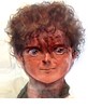
I have now twice been asked in emails about the self portrait that I use on this blog (look over in the sidebar -- it's right at the top), so I figure perhaps it is worth answering here in case anyone else is curious.
The picture is a photo I took of myself in a mirror altered through the Perception Laboratory's Face Transformer, which you can play with by clicking the link. It's a little java script that transforms faces in uploaded photos. Most of the settings are about changing the race, sex or age of the subject, but a few adopt certain artistic styles -- the available ones are Botticelli, Modigliani, El Greco and then "manga cartoon" (as a general style). There's also a "drunk" setting and an "ape-man" setting that makes a sort of Planet-of-the-Apes like picture. The picture I use of myself was transformed with their program using the "manga" setting.
Frankly, the results from the transformer are hit-and-miss -- and far more often miss than hit. Most of the race/sex/age transformations aren't remotely convincing, although occasionally you get one that's not half bad. The artistic ones are fun -- but most of the results come out looking fairly similar: the base photo is often largely obscured by the transformation. (You can see why if you upload something that isn't a face and try the transformations on it.) But sometimes it works -- the right photo with the right setting can produce a fun result. It's certainly a lot of fun to play with -- a great time waster. I liked the manga version of that image of me -- I thought it looked almost like an actual manga drawing -- so I use it.
If you're interested, a larger version of the same picture can be seen here -- but I think that the close-up actually doesn't work as well: the seams show. (A commentator on the site where the larger photo is hosted said that it's "the most frightening flipping thing I have ever seen.") So just as a general effect the smaller one works better. But the larger one is interesting if you're curious about how the transformer works, since you can see the original image under the transformation.
Unrelated Afterthought: While I'm engaging in meta-blogging, I'll note that, with this post, March 2007 has just tied July 2006 as the months in which I've posted the most entries: 20 each. (My average over the lifetime of the blog is 11-12 a month.) And the latter included four posts which were just posting someone else's writing -- letters from my sister-in-law, from when she was trapped in Beirut during the July War. (On the other hand, last July the posts that I did write included several of my favorite posts to date.)
Saturday, March 31, 2007
Friday, March 30, 2007
100 Great Pages: Luigi Serafini's Codex Seraphinianus, page 39
Fifth of a series of posts about 100 great comics pages.
Links to: an introduction to the series; an index of posts by creator; an index of posts by title.
When I began this series, I made a list of the first few entries I wanted to do and a large number of other works that I wanted to get around to eventually. But I always knew that happenstance would play a major part. In the case of the Codex Seraphinianus, created by Italian artist Luigi Serafini, the chance was my discovering (via Eddie Campbell) that it had been posted online, in its entirety, as a Flickr set.
I described the Codex in my earlier post, but to recap briefly: the Codex Seraphinianus is a fictional encyclopedia, presented as if it was an alien artifact: written entirely in an undecipherable alien script, with strange and hallucinogenic illustrations throughout the text giving glimpses of pregnant, elusive meaning. Whether it is supposed to be from an entirely alien world (in which case the obvious people sometimes included are puzzling), from an alien looking at our world (in which case the obviously fantastical lifeforms, places, etc, are puzzling), or something else, is unclear. It's a masterpiece of suggestive mystery, of meaningful nonsense. Like many people, I first heard of it from an off-hand comment in Douglas Hofstadter's Metamagical Themas; but until its recent posting I had only seen the various sample pages available here and there on the web, and had never read it in its entirety (as it is rare and quite expensive). Having actually read it, I knew I had to include a page in this series.
But have I in fact even read it now? In my earlier blog post about the Codex, I wondered whether the word "read" was the proper word to use in discussing it. I have looked at every page -- some for longer, some for less time: the text-only pages -- at a very rough guess, perhaps a fifth of the total -- are, obviously, particularly unrewarding; many of the heavily illustrated pages are so beautiful that they took my breath away. I have never used hallucinogens, but looking at the Codex makes me feel as if I know what LSD must be like. But have I read it? Is "read" the right word?
I have come to the conclusion that it is not. This is true even though I would without hesitation say I had "read" a silent comic like Peter Kuper's Sticks & Stones or Evan Drooker's Flood. The reason is that in the context of a work like the Codex, "read" implies something untrue -- that one has actually read the existent text and not simply looked at the images. Given that the text is, so far as anyone knows, nonsense (but see here), this is impossible; but to say, "I've read the Codex Seraphinianus" implies a mastery which is unwarranted. Further, while the pages are definitely better seen in sequence -- you get a lot more out of it approaching it as a whole work, with a given order,* than simply looking at any given sample pages (said the man writing a series of blog posts about pages taken out of context) -- you don't quite read the images the way that one "reads" (by which I mean something like "performs closure on", to use McCloud's term) silent comics. Say, therefore, that I have "looked through" the Codex: it will be more accurate.
In fact, since I have announced this as a series of great comics pages, including the Codex begs the question of whether it is comics or not. Now Eddie Campbell would argue vehemently that these categories are reductive: that one shouldn't care whether or not the Codex is comics -- one should simply care that it's good. And on many levels I agree with him. But since I disagree with him on equally many levels -- and since I don't want to try to weigh in on The Great Campbell/McCloud Debate™ now (though I may at some point in the future) -- I'll simply note that the page I'm discussing happens to be a page of comics, at least by the Eisner/McCloud definition of comics as "sequential art".** A few of the pages have sequences of art that are clearly meant to be read as temporal sequence -- i.e. are comics by the Eisner/McCloud definition -- but this page is rare in being dominated by a lengthy, comics-like sequence. I think the only other one laid out in quite so traditional a comics fashion is page 41 -- two pages later. (What that means I don't know, although the pages are thematically quite similar in a lot of ways.) So even if you won't call the Codex comics in its entirety -- and I pretty much wouldn't -- I think most people would agree that this page is comics.
Anyway, it's wonderful, and from a wonderful book, so bollocks to the definitions.***
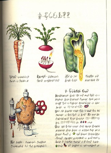
So here is page 39:

(Click for a larger version.)
I've rotated the image 90 degrees so that its (apparent, to us) proper orientation is up -- as one would, presumably, rotate the book if one shelled out the money to have a dead-tree copy in one's hands -- but if you want to see what it looks like in the book, click here.
In many ways, the "story" here is readily comprehensible -- although the story one gets out of it is distinctly surreal. In the first panel, we are shown a map (its status as a map made clear by the labeling, in the now-familiar alien script, which is on it); in the second through fifth panels we are shown rains, followed by the growth of some sort of crop; in the sixth panel, we see the crop harvested; in the seventh, we are shown in close-up what the crop is: ball-point pens, which grow in the manner of tubers; and in the final panel we are shown the use that these are put to: they are used as the components of necklaces.
(Page forty-one, which as I said is very similar in structure, shows the growth of chairs -- not as parts then manufactured, but as full chairs -- which are then sat on by (for some reason) someone wearing ice-skates.)
It's worth noting that this is hardly the strangest page in the book -- indeed, its very nature as comics makes it among the most straightforwardly comprehensible. Nevertheless, its combination of real and imaginary features, its reordering of the familiar world in a strange way, makes it (in many ways) quite typical of the Codex.
But what are we to make of this presentation? Is the Codex describing a world in which this actually takes place? Or is this the misinterpretation that an alien culture has of our world? Or is it supposed to be metaphorical -- about creation having its roots in the earth, and hanging like a chain about our necks? -- Further, is this an answerable question -- that is, if one studies the Codex for long enough, can one figure out where and when it is supposed to document? Or is it just an exercise in defamiliarization, a playful romp in the gardens of the strange? (If ever there's been an artistic object which aims for, and achieves, defamiliarization, it's the Codex Seraphinianus.) I don't know the answer to any of these questions: I enjoy the page as an exercise in dream-like strangeness, but I don't know what to make of it.
In discussion at Eddie Campbell's blog I said that the Codex as a whole reminded me of Jim Woodring's Frank, in its eerie, often-unsettling, dream-like (or hallucinogenic) tales which mix the familiar and the strange. A commentator, "John C" (who I think is the same John C who wrote perceptively about the Codex here) replied that he thought "it most closely resembles European fantasy works like those one sees from Roland Topor and various bande desinée artists rather than people like Jim Woodring." I'll stand by my Woodring thought, though I admit that it may well have as much to do with my limited frame of reference than anything else. (Jacek Yerka also strikes me as similar in spirit.) Overall, obviously, the dominant mode is surrealism; beyond that, I don't know.
Let me take one small topic: the alien script. What is it doing in this page? Well, it changes the viewpoint: it makes what we see a representative example rather than a specific incident. It implies a whole society -- that this is a tradition, a habit -- rather than, say, some strange specific incident in which pens happened to grow like tubers in the ground, and we had so many of them that we made necklaces. The script (along with the greater context) even helps establish a narrative voice -- one of detached description -- that we then read as the intent behind the pictures. We might be wrong about that voice: it's how encyclopedias that we know are written, and might not really apply to the Codex at all, given that its supposed to be alien. But I think we tend to impute that tone to the Codex, fairly or not. And, of course, once one thinks of the Codex as a product of an alien society, we realize that we are imputing to it all sorts of things that might be wrong: even the idea that the squiggles in question are a script (with an implied language and meaning behind them, even if we can't know them) -- and not, say, simply decoration, or their portraits of the strings of which matter is made -- is simply an assumption that may be wrong. The alienness of the Codex necessarily destabilizes all our attempts to bring meaning to it (although, at the same time, we can hardly help doing so.****) There's no question that the script is absolutely essential to the feel and nature and meaning (whatever that is) of the Codex -- even if we do skip by the all-text pages quickly (for what can one make of them?), their presence is important in helping shape the meaning of more heavily image-based pages such as page thirty-nine.
Surely it's important that this page (and its cousin, page forty-one) are in the "flora" section (again, see my first footnote below), which consists of drawings and sketches and diagrams and so forth of plants. It shapes how we feel about the page; but I don't think it makes it mean any one thing.
Is asking about its meaning just silly? Is it all just supposed to be beautiful and strange? Or, on the other hand, are we missing something big if we just groove on its strangeness rather than seek more specific meaning (it certainly seems set up to encourage us to do the latter).
Did I mention that the art is beautiful?
And what are we to make of the watch in the penultimate panel, the one where we see the man holding the tuber-pen out? That's a very modern-looking wrist-watch.
Is it comics? Have I read it? What does it mean? I don't know. But I know that it's wonderful. (Can I know that without knowing what it is or what it means? I think so, but it's a funny situation to be in.) Go take a look and see what you think.
Update: Nothing to do with the Codex, but Eddie Campbell (whose name I took in vain above) and I are hashing out issues of definition in the comments. Worth a look.
___________________________________
* The Codex is quite distinctly divided into eleven sections, each with a title page, introduction and table of some sort (a summary? a table of contents?) before the main matter. Further, the rough subject of each section is fairly clear (various different attempts to label the sections come out quite similarly). And each section gains in coherence if looked through all together in order -- although admittedly not by much.
** I think that there are three major definitions of comics/graphic novels in play right at the moment. The first, which I think of as the Eisner/McCloud definition, is that comics are "sequential art"; the second, which I think of as the Pekar/Harvey definition, is that comics are "words and pictures"; the third, which I think of as the Horrocks/Campbell definition, is that comics can only be defined by what they historically have been, with a strong dose of "to hell with all this definition crap" mixed in in the bargain. As far as I'm concerned, all three have their merits; and one can most fruitfully engage with the field of comics by using, in various ways, all three.
The Codex is "new lit" by Eddie Campbell's definition -- a graphic novel but not comics (good enough for my purposes); this page, at least, is clearly comics in the Eisner/McCloud sense, even if the whole is not. But is this page comics under the Pekar/Harvey definition? Does an undecipherable alien script count as "words"? I shall argue in a moment (or have argued above, if you're reading the footnotes all together at the end) that the script is essential to the meaning (the feel, the effect, the nature...) of the Codex. But is it words? It's certainly supposed to make us think of words.)
*** Which is Eddie Campbell's basic point about the definitions, if I understand him properly.
**** An interesting test: can we think of this page -- page thirty-nine -- as not comics in the Eisner/McCloud sense? By this I mean: can we try not to process the images as a temporal (causal) sequence, showing us a location, a sequence of events, a use? Scott McCloud says that his iconic picture:

is comics if we read it as a man raising a hat -- but isn't if we read it as a picture of two men, one raising a hat. (Well, he says it of two squares. But you get my point.) But at any length, it becomes well-nigh impossible not to see most comics as sequential art -- not to do closure. Can we imagine an alien race alien enough to make a page like this and not intend sequence? (It's hard.)
Links to: an introduction to the series; an index of posts by creator; an index of posts by title.
When I began this series, I made a list of the first few entries I wanted to do and a large number of other works that I wanted to get around to eventually. But I always knew that happenstance would play a major part. In the case of the Codex Seraphinianus, created by Italian artist Luigi Serafini, the chance was my discovering (via Eddie Campbell) that it had been posted online, in its entirety, as a Flickr set.
I described the Codex in my earlier post, but to recap briefly: the Codex Seraphinianus is a fictional encyclopedia, presented as if it was an alien artifact: written entirely in an undecipherable alien script, with strange and hallucinogenic illustrations throughout the text giving glimpses of pregnant, elusive meaning. Whether it is supposed to be from an entirely alien world (in which case the obvious people sometimes included are puzzling), from an alien looking at our world (in which case the obviously fantastical lifeforms, places, etc, are puzzling), or something else, is unclear. It's a masterpiece of suggestive mystery, of meaningful nonsense. Like many people, I first heard of it from an off-hand comment in Douglas Hofstadter's Metamagical Themas; but until its recent posting I had only seen the various sample pages available here and there on the web, and had never read it in its entirety (as it is rare and quite expensive). Having actually read it, I knew I had to include a page in this series.
But have I in fact even read it now? In my earlier blog post about the Codex, I wondered whether the word "read" was the proper word to use in discussing it. I have looked at every page -- some for longer, some for less time: the text-only pages -- at a very rough guess, perhaps a fifth of the total -- are, obviously, particularly unrewarding; many of the heavily illustrated pages are so beautiful that they took my breath away. I have never used hallucinogens, but looking at the Codex makes me feel as if I know what LSD must be like. But have I read it? Is "read" the right word?
I have come to the conclusion that it is not. This is true even though I would without hesitation say I had "read" a silent comic like Peter Kuper's Sticks & Stones or Evan Drooker's Flood. The reason is that in the context of a work like the Codex, "read" implies something untrue -- that one has actually read the existent text and not simply looked at the images. Given that the text is, so far as anyone knows, nonsense (but see here), this is impossible; but to say, "I've read the Codex Seraphinianus" implies a mastery which is unwarranted. Further, while the pages are definitely better seen in sequence -- you get a lot more out of it approaching it as a whole work, with a given order,* than simply looking at any given sample pages (said the man writing a series of blog posts about pages taken out of context) -- you don't quite read the images the way that one "reads" (by which I mean something like "performs closure on", to use McCloud's term) silent comics. Say, therefore, that I have "looked through" the Codex: it will be more accurate.
In fact, since I have announced this as a series of great comics pages, including the Codex begs the question of whether it is comics or not. Now Eddie Campbell would argue vehemently that these categories are reductive: that one shouldn't care whether or not the Codex is comics -- one should simply care that it's good. And on many levels I agree with him. But since I disagree with him on equally many levels -- and since I don't want to try to weigh in on The Great Campbell/McCloud Debate™ now (though I may at some point in the future) -- I'll simply note that the page I'm discussing happens to be a page of comics, at least by the Eisner/McCloud definition of comics as "sequential art".** A few of the pages have sequences of art that are clearly meant to be read as temporal sequence -- i.e. are comics by the Eisner/McCloud definition -- but this page is rare in being dominated by a lengthy, comics-like sequence. I think the only other one laid out in quite so traditional a comics fashion is page 41 -- two pages later. (What that means I don't know, although the pages are thematically quite similar in a lot of ways.) So even if you won't call the Codex comics in its entirety -- and I pretty much wouldn't -- I think most people would agree that this page is comics.
Anyway, it's wonderful, and from a wonderful book, so bollocks to the definitions.***
So here is page 39:

(Click for a larger version.)
I've rotated the image 90 degrees so that its (apparent, to us) proper orientation is up -- as one would, presumably, rotate the book if one shelled out the money to have a dead-tree copy in one's hands -- but if you want to see what it looks like in the book, click here.
In many ways, the "story" here is readily comprehensible -- although the story one gets out of it is distinctly surreal. In the first panel, we are shown a map (its status as a map made clear by the labeling, in the now-familiar alien script, which is on it); in the second through fifth panels we are shown rains, followed by the growth of some sort of crop; in the sixth panel, we see the crop harvested; in the seventh, we are shown in close-up what the crop is: ball-point pens, which grow in the manner of tubers; and in the final panel we are shown the use that these are put to: they are used as the components of necklaces.
(Page forty-one, which as I said is very similar in structure, shows the growth of chairs -- not as parts then manufactured, but as full chairs -- which are then sat on by (for some reason) someone wearing ice-skates.)
It's worth noting that this is hardly the strangest page in the book -- indeed, its very nature as comics makes it among the most straightforwardly comprehensible. Nevertheless, its combination of real and imaginary features, its reordering of the familiar world in a strange way, makes it (in many ways) quite typical of the Codex.
But what are we to make of this presentation? Is the Codex describing a world in which this actually takes place? Or is this the misinterpretation that an alien culture has of our world? Or is it supposed to be metaphorical -- about creation having its roots in the earth, and hanging like a chain about our necks? -- Further, is this an answerable question -- that is, if one studies the Codex for long enough, can one figure out where and when it is supposed to document? Or is it just an exercise in defamiliarization, a playful romp in the gardens of the strange? (If ever there's been an artistic object which aims for, and achieves, defamiliarization, it's the Codex Seraphinianus.) I don't know the answer to any of these questions: I enjoy the page as an exercise in dream-like strangeness, but I don't know what to make of it.
In discussion at Eddie Campbell's blog I said that the Codex as a whole reminded me of Jim Woodring's Frank, in its eerie, often-unsettling, dream-like (or hallucinogenic) tales which mix the familiar and the strange. A commentator, "John C" (who I think is the same John C who wrote perceptively about the Codex here) replied that he thought "it most closely resembles European fantasy works like those one sees from Roland Topor and various bande desinée artists rather than people like Jim Woodring." I'll stand by my Woodring thought, though I admit that it may well have as much to do with my limited frame of reference than anything else. (Jacek Yerka also strikes me as similar in spirit.) Overall, obviously, the dominant mode is surrealism; beyond that, I don't know.
Let me take one small topic: the alien script. What is it doing in this page? Well, it changes the viewpoint: it makes what we see a representative example rather than a specific incident. It implies a whole society -- that this is a tradition, a habit -- rather than, say, some strange specific incident in which pens happened to grow like tubers in the ground, and we had so many of them that we made necklaces. The script (along with the greater context) even helps establish a narrative voice -- one of detached description -- that we then read as the intent behind the pictures. We might be wrong about that voice: it's how encyclopedias that we know are written, and might not really apply to the Codex at all, given that its supposed to be alien. But I think we tend to impute that tone to the Codex, fairly or not. And, of course, once one thinks of the Codex as a product of an alien society, we realize that we are imputing to it all sorts of things that might be wrong: even the idea that the squiggles in question are a script (with an implied language and meaning behind them, even if we can't know them) -- and not, say, simply decoration, or their portraits of the strings of which matter is made -- is simply an assumption that may be wrong. The alienness of the Codex necessarily destabilizes all our attempts to bring meaning to it (although, at the same time, we can hardly help doing so.****) There's no question that the script is absolutely essential to the feel and nature and meaning (whatever that is) of the Codex -- even if we do skip by the all-text pages quickly (for what can one make of them?), their presence is important in helping shape the meaning of more heavily image-based pages such as page thirty-nine.
Surely it's important that this page (and its cousin, page forty-one) are in the "flora" section (again, see my first footnote below), which consists of drawings and sketches and diagrams and so forth of plants. It shapes how we feel about the page; but I don't think it makes it mean any one thing.
Is asking about its meaning just silly? Is it all just supposed to be beautiful and strange? Or, on the other hand, are we missing something big if we just groove on its strangeness rather than seek more specific meaning (it certainly seems set up to encourage us to do the latter).
Did I mention that the art is beautiful?
And what are we to make of the watch in the penultimate panel, the one where we see the man holding the tuber-pen out? That's a very modern-looking wrist-watch.
Is it comics? Have I read it? What does it mean? I don't know. But I know that it's wonderful. (Can I know that without knowing what it is or what it means? I think so, but it's a funny situation to be in.) Go take a look and see what you think.
Update: Nothing to do with the Codex, but Eddie Campbell (whose name I took in vain above) and I are hashing out issues of definition in the comments. Worth a look.
___________________________________
* The Codex is quite distinctly divided into eleven sections, each with a title page, introduction and table of some sort (a summary? a table of contents?) before the main matter. Further, the rough subject of each section is fairly clear (various different attempts to label the sections come out quite similarly). And each section gains in coherence if looked through all together in order -- although admittedly not by much.
** I think that there are three major definitions of comics/graphic novels in play right at the moment. The first, which I think of as the Eisner/McCloud definition, is that comics are "sequential art"; the second, which I think of as the Pekar/Harvey definition, is that comics are "words and pictures"; the third, which I think of as the Horrocks/Campbell definition, is that comics can only be defined by what they historically have been, with a strong dose of "to hell with all this definition crap" mixed in in the bargain. As far as I'm concerned, all three have their merits; and one can most fruitfully engage with the field of comics by using, in various ways, all three.
The Codex is "new lit" by Eddie Campbell's definition -- a graphic novel but not comics (good enough for my purposes); this page, at least, is clearly comics in the Eisner/McCloud sense, even if the whole is not. But is this page comics under the Pekar/Harvey definition? Does an undecipherable alien script count as "words"? I shall argue in a moment (or have argued above, if you're reading the footnotes all together at the end) that the script is essential to the meaning (the feel, the effect, the nature...) of the Codex. But is it words? It's certainly supposed to make us think of words.)
*** Which is Eddie Campbell's basic point about the definitions, if I understand him properly.
**** An interesting test: can we think of this page -- page thirty-nine -- as not comics in the Eisner/McCloud sense? By this I mean: can we try not to process the images as a temporal (causal) sequence, showing us a location, a sequence of events, a use? Scott McCloud says that his iconic picture:
Thursday, March 29, 2007
Libertarianism in a Nutshell
Andrew Sullivan "fisks" David Brooks today. And in the course of so doing, he writes:
Of course, libertarians like to posture as people who always make the trade-off between government and liberty in favor of liberty. But it's a fundamentally dishonest posture: it's one that allows them to debate the question on their (imaginary) grounds, 'should we choose government or freedom', while avoiding the difficult question that everyone who is not an anarchist actually faces: what precisely should government do and not do? This is one of the (many) reasons why I don't agree with libertarian views; it is a rhetorical posture that hides the true issues. Thus, for example, for a generation Republicans have campaigned against taxes in a broad and general way. But only anarchists think there should be no taxes (since governments, like any other institution, require funding); but "what should we have government for, and how should we tax to pay for it?" is less rhetorically powerful.
But beneath this dishonesty -- one that Sullivan buys into, presumably because it is so common in libertarian rhetoric (I am not accusing him of deliberate dishonesty here) -- is another fundamental error: namely, the premise behind the libertarian posture, that "bigger government always means less personal liberty". Sullivan calls this "simply a fact"; but (in fact) it's not: it's a myth, and a pernicious one.
This is easiest to see when looking at the reductio ad absurdum of the claim -- which, as I already said, is anarchy. Anarchy does not produce more personal liberty: it produces (as we see to far too great an extent in the hell that is contemporary Iraq) far less of it. In an anarchy, people don't even have the freedom to walk down the street: because they will far-too-likely be kidnapped or killed. Anarchy produces only the freedoms to shiver in fear in a basement -- or to become a thug and gangster and try to out-kill and out-kidnap your rivals.
But if that's the easy case, the others are fairly easy too. Let's take Sullivan's economic generalization: "it is simply true that every dollar taken by the government is one dollar less for you and me to spend on what we decide is best." This would be true of the number of dollars were a fixed sum; but of course it isn't. It is often the case that the government will take a sum in taxes -- and use it to produce things that create far more economic growth than what was taken. (Roads are an obvious example here.) Thus people actually end up with a lot more money to spend on what they decide is best.
Or take Sullivan's second generalization: "every freedom removed or infringed by the government is one less for you and me to enjoy". This, too, is simply wrong. Here my favorite example (one due to Elizabeth Anderson (specifically here)) is traffic laws. Traffic laws restrict our liberty in specific circumstances in all sorts of ways -- we can't drive when sitting at a red light. But without them, all one gets is gridlock: as Anderson says, a situation in which we have "the formal freedom to choose any movement in one's opportunity set--which amounts to being able to rock forward and back a couple of inches from bumper to bumper, getting nowhere." Go read her post for a more extended version of the metaphor. The point is that government regulation can increase freedom as well as diminish it.
This isn't true of all government, of course. But that's why the fundamentally silly question of "more or less government" (or "bigger or smaller" government) should be set aside, and we should ask what policies produce the best outcomes: the freest, safest, richest society one can manage. And of course in that calculation there are trade-offs and mistakes. There are even some specific cases where a trade-off can be usefully analyzed as one between bigger government and more liberty (and far more cases which can be shoe-horned into that mold). But the idea that eliminating a government function always increases freedom is just silly.
To produce a just, safe, rich -- and, yes, free -- society, we need to get away from the silly abstract question of "how much government", and start thinking about the ways in which government can create a society which allows for the maximum possible freedom (and justice, safety and wealth -- since I don't think that freedom is the only virtue.) An less clownish version of libertarianism is one that argues that freedom is the only virtue that we should take seriously -- but which recognizes that government is sometimes essential to that freedom, and that lack of freedom can come from sources besides government. This would to my mind produce nightmarish results -- since, again, I don't think freedom is the only virtue worth pursuing; I think that justice and security and wealth have some value too.* But at least that sort of argument doesn't have a silly analysis of cause and effect at its base.
When speaking on specific issues libertarians often make extremely valuable contributions, reminding us of the importance of freedom and liberty as values to take into account. But their analysis of how to get there -- which is all to often 'less government', full stop -- is ridiculous as a general principle (even if, in some specific cases it will be right on the merits: some government programs reduce liberty and should as a consequence be scrapped. But that's as a result of specific, contingent factors and specific choices to be weighed and balanced -- not a general rule).
Sullivan's simple fact is not merely opinion: it's simply wrong. But it's too common a belief -- or at least rhetorical move -- in our political discourse. We need to get rid of it in order to think in a useful way about what sort of society we want, and how best to get there.
Update: Thanks to Andrew Sullivan for the link! And welcome, fellow Daily Dish readers. More in the sidebar if you're interested -- feel free to look around, kick off your shoes, stay awhile.
__________________________
* Here you get trade-offs -- although any 'more justice/security is less freedom' analysis will be just as simplistic as the 'more government is less freedom' analysis is -- and just as wrong.
But bigger government always means less personal liberty. This is simply a fact, not an opinion. The trade-off is always there. It may be worth it in some instances - which is why I'm not a libertarian. But it is simply true that every dollar taken by the government is one dollar less for you and me to spend on what we decide is best; every freedom removed or infringed by the government is one less for you and me to enjoy. You can defend the trade-off, and should at times, but please don't pretend it isn't there.Now of course Sullivan says he isn't a libertarian, because he thinks that the trade-off is sometimes worth it. This is based on a fundamentally false premise, however, because libertarians also 'think the trade-off is sometimes worth it'. Those who don't think the (supposed) "trade-off" is worth it -- that is, who think both that "bigger government always means less personal liberty" and that one should always decide on the side of smaller government/more personal liberty -- aren't libertarians at all: they're anarchists. This is the logical outcome: any given choice is between government and liberty; always choose liberty; no government is the obvious result.
Of course, libertarians like to posture as people who always make the trade-off between government and liberty in favor of liberty. But it's a fundamentally dishonest posture: it's one that allows them to debate the question on their (imaginary) grounds, 'should we choose government or freedom', while avoiding the difficult question that everyone who is not an anarchist actually faces: what precisely should government do and not do? This is one of the (many) reasons why I don't agree with libertarian views; it is a rhetorical posture that hides the true issues. Thus, for example, for a generation Republicans have campaigned against taxes in a broad and general way. But only anarchists think there should be no taxes (since governments, like any other institution, require funding); but "what should we have government for, and how should we tax to pay for it?" is less rhetorically powerful.
But beneath this dishonesty -- one that Sullivan buys into, presumably because it is so common in libertarian rhetoric (I am not accusing him of deliberate dishonesty here) -- is another fundamental error: namely, the premise behind the libertarian posture, that "bigger government always means less personal liberty". Sullivan calls this "simply a fact"; but (in fact) it's not: it's a myth, and a pernicious one.
This is easiest to see when looking at the reductio ad absurdum of the claim -- which, as I already said, is anarchy. Anarchy does not produce more personal liberty: it produces (as we see to far too great an extent in the hell that is contemporary Iraq) far less of it. In an anarchy, people don't even have the freedom to walk down the street: because they will far-too-likely be kidnapped or killed. Anarchy produces only the freedoms to shiver in fear in a basement -- or to become a thug and gangster and try to out-kill and out-kidnap your rivals.
But if that's the easy case, the others are fairly easy too. Let's take Sullivan's economic generalization: "it is simply true that every dollar taken by the government is one dollar less for you and me to spend on what we decide is best." This would be true of the number of dollars were a fixed sum; but of course it isn't. It is often the case that the government will take a sum in taxes -- and use it to produce things that create far more economic growth than what was taken. (Roads are an obvious example here.) Thus people actually end up with a lot more money to spend on what they decide is best.
Or take Sullivan's second generalization: "every freedom removed or infringed by the government is one less for you and me to enjoy". This, too, is simply wrong. Here my favorite example (one due to Elizabeth Anderson (specifically here)) is traffic laws. Traffic laws restrict our liberty in specific circumstances in all sorts of ways -- we can't drive when sitting at a red light. But without them, all one gets is gridlock: as Anderson says, a situation in which we have "the formal freedom to choose any movement in one's opportunity set--which amounts to being able to rock forward and back a couple of inches from bumper to bumper, getting nowhere." Go read her post for a more extended version of the metaphor. The point is that government regulation can increase freedom as well as diminish it.
This isn't true of all government, of course. But that's why the fundamentally silly question of "more or less government" (or "bigger or smaller" government) should be set aside, and we should ask what policies produce the best outcomes: the freest, safest, richest society one can manage. And of course in that calculation there are trade-offs and mistakes. There are even some specific cases where a trade-off can be usefully analyzed as one between bigger government and more liberty (and far more cases which can be shoe-horned into that mold). But the idea that eliminating a government function always increases freedom is just silly.
To produce a just, safe, rich -- and, yes, free -- society, we need to get away from the silly abstract question of "how much government", and start thinking about the ways in which government can create a society which allows for the maximum possible freedom (and justice, safety and wealth -- since I don't think that freedom is the only virtue.) An less clownish version of libertarianism is one that argues that freedom is the only virtue that we should take seriously -- but which recognizes that government is sometimes essential to that freedom, and that lack of freedom can come from sources besides government. This would to my mind produce nightmarish results -- since, again, I don't think freedom is the only virtue worth pursuing; I think that justice and security and wealth have some value too.* But at least that sort of argument doesn't have a silly analysis of cause and effect at its base.
When speaking on specific issues libertarians often make extremely valuable contributions, reminding us of the importance of freedom and liberty as values to take into account. But their analysis of how to get there -- which is all to often 'less government', full stop -- is ridiculous as a general principle (even if, in some specific cases it will be right on the merits: some government programs reduce liberty and should as a consequence be scrapped. But that's as a result of specific, contingent factors and specific choices to be weighed and balanced -- not a general rule).
Sullivan's simple fact is not merely opinion: it's simply wrong. But it's too common a belief -- or at least rhetorical move -- in our political discourse. We need to get rid of it in order to think in a useful way about what sort of society we want, and how best to get there.
Update: Thanks to Andrew Sullivan for the link! And welcome, fellow Daily Dish readers. More in the sidebar if you're interested -- feel free to look around, kick off your shoes, stay awhile.
__________________________
* Here you get trade-offs -- although any 'more justice/security is less freedom' analysis will be just as simplistic as the 'more government is less freedom' analysis is -- and just as wrong.
Sunday, March 25, 2007
Comic Book Thinking
Quoth the Rabbi (via):

Er, well, no, I guess not that one. Here's another!

Er, maybe not that one either. But surely this --

No, well, I guess not his comics either.
Maybe the Rabbi is reading the wrong comic books.
Religiously speaking, this is the belief that God gave freedom to all people made in His image, and that those who oppose freedom must be prepared to fight God.... It’s obvious to me that movies and comic books can make this case better than any subtle novel and more authentically than any spin-tested political speech. Comic books, and the graphic novels that evolved from them, are about the struggle of good against evil. Other art forms can make the claim that everything is gray, nothing is true, and nothing eternal. Of course these latter claims may be right, but if they are, then the age of heroes is over...Hmm, yes, the struggle against good and evil! Those who fight freedom fight God! The message of Graphic Novels! Yes of course. Like, for instance, this one:


Maybe the Rabbi is reading the wrong comic books.
Saturday, March 24, 2007
100 Great Pages: Grant Morrison & Frank Quitely's We3 #2, pages 6-7
Fourth of a series of posts about 100 great comics pages.
Links to: an introduction to the series; an index of posts by creator; an index of posts by title.
Grant Morrison is widely regarded as one of the greatest of mainstream comics writers -- one of the few who might challenge Alan Moore for the slot of the single greatest mainstream comics writer ever. (Personally, I think Moore is clearly better; but Morrison is one of the few people for whom a case can be -- and often is is -- made.) Like Moore, Morrison has worked with many different artists in his career; but one of his most frequently collaborators has been Frank Quitely. Much of Morrison's best work has been with Quitely; indeed, comics scholar Geoff Klock has been recently arguing that in at least one case (Morrison's run on New X-Men) Morrison's work is variable in quality and is at its best with Quitely's collaboration. And the reverse is true too: Quitely, who is one of the very best mainstream comics artists working today, has done his best work with Morrison.
Morrison and Quitely's collaborations include (AFAIK this is a complete list (see update below)): Flex Mentallo (Morrison's sadly as-yet un-reprinted multiply metafictional masterpiece); JLA: Earth 2, a one-shot about the DC comics group; the very last issue of Morrison's long-running Vertigo series, The Invisibles; the currently ongoing series All-Star Superman; 10 issues of Morrison's 41-issue run on New X-Men; and, last but quite definitely not least, a short, three-issue series called We3, since published as a single graphic novel by Vertigo.
As that list indicates, Morrison often writes quite well-known superhero comics (Superman, X-Men, JLA); but We3, despite a few stylistic similarities, is not a superhero story: it's SF.* It's a story about three animals -- a dog, a cat and a rabbit -- who have been the subjects of an experiment to turn them into prototypes of a new sort of cyborg warrior. They are encased in battle armor, and they have been biologically altered in various ways -- for instance, their intelligence is enhanced, and they have (limited) speaking capabilities. And they are armed to the teeth. The graphic novel is about what happens when the three animals escape (with some assistance), and the agency responsible for their transformation goes after them.
As a story, We3 is comparatively straightforward, and is open to the charge of sentimentality about its animal protagonists. But it is extremely well told; grapples with the complex ethical issues of deadly warriors who are not themselves responsible for the fact that they are dangerous (and yet are no less dangerous for that); and, all in all, is a fun, gripping action-oriented SF story. Above all, in We3, Quitely's art is simply superb -- gorgeous, innovative and affecting. (Quitely's art is colored and digitally inked by Jamie Grant, who also deserves notice here. (The comic was lettered by Todd Klein, although I don't think we see an of his work in the page I'm going to discuss, as there isn't any dialog.))
The page I wish to discuss -- or pair of pages, if you prefer, since it is a two-page spread; but obviously it works as a single visual unit, and so I think it clearly counts as a page in some sense (including for the purposes of this series) -- is from an action sequence from early in issue 2,** in which the cyborg animals battle a team of soldiers who have been sent to hunt them down. Here's what it looks like:
The first impression from this two-page spread is of chaos: multiple fragmented panels, many overlapping; the superimposed figure of the cyborg dog on the top half of the page; the shifting viewpoints within the smaller panels. It's interesting, it's fresh; the question is, however, what's it doing? Is it just done differently to be cool?
And the answer is: no. It's that (and that's a good thing); but it's more than that, too.
There are, I believe, two possible interpretations of this page. Two pages before this sequence (#2, p. 4), one of the scientists responsible for changing the animals says of them "even their sense are different from ours. They're much faster than any human. They experience time and motion differently." So one might simply say that this is supposed to represent the view of the animals. But I don't think that's so. There's little in these pages to suggest that we are supposed to be seeing from the animals' viewpoint; in fact, in most views we're clearly not.
Rather, I think this page is a representation of the experience of battle: it's chaos, its speed, its gore and destructiveness and terror. And, yes, its excitement: even many soldiers who return from war disillusioned or as peace activists will admit to the power of the adrenaline surge that accompanies combat.
As it happens, the page is not quite as chaotic as it seems. If you take the time to read the sequence of panels carefully, you can see -- as Quitely himself says in this interview, "They actually do work in a sequence – there’re lots and lots there, so if you can be bothered, there’s stuff you can look at." The top row of what Quitely calls the "wee tiny" panels superimposed upon the larger one show, very clearly, the dog cyborg firing his built-in gun and a bullet hitting one of the soldiers in the eye. It's all in fragments: the tip of the weaponized limb, the bullet breaking the glass, a glob of blood. But it's perfectly comprehensible.
Similarly, all of the multiple, overlapping panels which are superimposed over the lower half of the page simply show the cat cyborg firing a bunch of spikes and piercing a few soldiers (you can tell its more than one because one has a beard and one does not), killing them quickly and terribly.) The fact that it's all in fragments, that the panels overlap and aren't in neat rows, is not simply visually striking (although it is that) -- not simply cool -- it also conveys something important: the experience of the battle. Superimposing multiple small panels over the large one give a sense of the speed of events that simply having them all in normal panel order would not (that would in fact make them seen drawn out, like slow-motion fights in films); having the panels overlap goes further and conveys the simultaneity (or near-simultaneity) of events. The partial images shown in the panels not only reflect the speed of events but also the fragmented comprehension that the men involved have of what is going on. Still, despite all of this, the sequence is comprehensible: if one takes the time (probably on a second or third reading) to slow down and put all the panels together, you can see that they make a coherent comics depiction of precisely what happens.
But, of course, that quote of Quitely's is followed by his line that "if you can’t be bothered, it’s simply carnage." And the point is that the page works on that level equally well. If you don't read all of the panels, you still get a key part of the experience, namely, the chaos and carnage and disorientation of a swift, deadly battle. The page represents the explosion of horror that happens the instant of the attack, erupting into the reader's view the moment the page is turned.
This is a great page because it is innovative comics: the shifting viewpoints, the reliance on what Scott McCloud would call aspect-to-aspect panel transition, the juxtaposition of small and large panels, etc, is all formally innovative (at least for Western comics: Morrison has said that part of what he was trying to do with We3 was to create "western manga", and certainly many of the techniques he and Quitely used had lots of precedent there (which is not to say that they didn't use them in innovative ways.)) But at the same time, the innovations are put to a crucial storytelling use: to conveying the nature of battle, the horror and the confusion and the excitement of it. This page (like much of We3) is an action sequence, solidly within the tradition thereof -- while at the same time being visually new and fresh (much like The Matrix in film). It takes an old idea -- a battle scene -- and makes it new again: closer to reality, more visually interesting, and still exciting. It can be read slowly, or glimpsed in an instant, and works at both speeds.
All of which makes it a great page. And if you like it, I suggest picking up a copy of We3, because chances are you'll like the rest of it too.
Update: Turns out that list of Morrison/Quitely collaborations was almost complete. Geoff Klock notes a Quitely interview where he mentions the one left off the list, a 9-page story called "New Toys" in Weird War Tales #3.
__________________________________
* This is off topic, but while the superhero genre is often discussed as if it's a sub-genre of fantasy (or occasionally SF), I think this is misleading; I think the genres are related in much the same way that horror and fantasy are related. A lot of horror has elements of fantasy, and some of it is inarguably fantasy; but it is also its own genre, with its own history, traditions, deviations, models and so forth. The same, I would argue, is true for the superhero genre.
** I'd prefer to give its page number in the trade paperback, since that's how I read the series -- but the paperback has no page numbers, and it's simplier to just count pages within each chapter (issue). So it's issue #2, pages 6-7.
Links to: an introduction to the series; an index of posts by creator; an index of posts by title.
Grant Morrison is widely regarded as one of the greatest of mainstream comics writers -- one of the few who might challenge Alan Moore for the slot of the single greatest mainstream comics writer ever. (Personally, I think Moore is clearly better; but Morrison is one of the few people for whom a case can be -- and often is is -- made.) Like Moore, Morrison has worked with many different artists in his career; but one of his most frequently collaborators has been Frank Quitely. Much of Morrison's best work has been with Quitely; indeed, comics scholar Geoff Klock has been recently arguing that in at least one case (Morrison's run on New X-Men) Morrison's work is variable in quality and is at its best with Quitely's collaboration. And the reverse is true too: Quitely, who is one of the very best mainstream comics artists working today, has done his best work with Morrison.
Morrison and Quitely's collaborations include (AFAIK this is a complete list (see update below)): Flex Mentallo (Morrison's sadly as-yet un-reprinted multiply metafictional masterpiece); JLA: Earth 2, a one-shot about the DC comics group; the very last issue of Morrison's long-running Vertigo series, The Invisibles; the currently ongoing series All-Star Superman; 10 issues of Morrison's 41-issue run on New X-Men; and, last but quite definitely not least, a short, three-issue series called We3, since published as a single graphic novel by Vertigo.
As that list indicates, Morrison often writes quite well-known superhero comics (Superman, X-Men, JLA); but We3, despite a few stylistic similarities, is not a superhero story: it's SF.* It's a story about three animals -- a dog, a cat and a rabbit -- who have been the subjects of an experiment to turn them into prototypes of a new sort of cyborg warrior. They are encased in battle armor, and they have been biologically altered in various ways -- for instance, their intelligence is enhanced, and they have (limited) speaking capabilities. And they are armed to the teeth. The graphic novel is about what happens when the three animals escape (with some assistance), and the agency responsible for their transformation goes after them.
As a story, We3 is comparatively straightforward, and is open to the charge of sentimentality about its animal protagonists. But it is extremely well told; grapples with the complex ethical issues of deadly warriors who are not themselves responsible for the fact that they are dangerous (and yet are no less dangerous for that); and, all in all, is a fun, gripping action-oriented SF story. Above all, in We3, Quitely's art is simply superb -- gorgeous, innovative and affecting. (Quitely's art is colored and digitally inked by Jamie Grant, who also deserves notice here. (The comic was lettered by Todd Klein, although I don't think we see an of his work in the page I'm going to discuss, as there isn't any dialog.))
The page I wish to discuss -- or pair of pages, if you prefer, since it is a two-page spread; but obviously it works as a single visual unit, and so I think it clearly counts as a page in some sense (including for the purposes of this series) -- is from an action sequence from early in issue 2,** in which the cyborg animals battle a team of soldiers who have been sent to hunt them down. Here's what it looks like:

The first impression from this two-page spread is of chaos: multiple fragmented panels, many overlapping; the superimposed figure of the cyborg dog on the top half of the page; the shifting viewpoints within the smaller panels. It's interesting, it's fresh; the question is, however, what's it doing? Is it just done differently to be cool?
And the answer is: no. It's that (and that's a good thing); but it's more than that, too.
There are, I believe, two possible interpretations of this page. Two pages before this sequence (#2, p. 4), one of the scientists responsible for changing the animals says of them "even their sense are different from ours. They're much faster than any human. They experience time and motion differently." So one might simply say that this is supposed to represent the view of the animals. But I don't think that's so. There's little in these pages to suggest that we are supposed to be seeing from the animals' viewpoint; in fact, in most views we're clearly not.
Rather, I think this page is a representation of the experience of battle: it's chaos, its speed, its gore and destructiveness and terror. And, yes, its excitement: even many soldiers who return from war disillusioned or as peace activists will admit to the power of the adrenaline surge that accompanies combat.
As it happens, the page is not quite as chaotic as it seems. If you take the time to read the sequence of panels carefully, you can see -- as Quitely himself says in this interview, "They actually do work in a sequence – there’re lots and lots there, so if you can be bothered, there’s stuff you can look at." The top row of what Quitely calls the "wee tiny" panels superimposed upon the larger one show, very clearly, the dog cyborg firing his built-in gun and a bullet hitting one of the soldiers in the eye. It's all in fragments: the tip of the weaponized limb, the bullet breaking the glass, a glob of blood. But it's perfectly comprehensible.
Similarly, all of the multiple, overlapping panels which are superimposed over the lower half of the page simply show the cat cyborg firing a bunch of spikes and piercing a few soldiers (you can tell its more than one because one has a beard and one does not), killing them quickly and terribly.) The fact that it's all in fragments, that the panels overlap and aren't in neat rows, is not simply visually striking (although it is that) -- not simply cool -- it also conveys something important: the experience of the battle. Superimposing multiple small panels over the large one give a sense of the speed of events that simply having them all in normal panel order would not (that would in fact make them seen drawn out, like slow-motion fights in films); having the panels overlap goes further and conveys the simultaneity (or near-simultaneity) of events. The partial images shown in the panels not only reflect the speed of events but also the fragmented comprehension that the men involved have of what is going on. Still, despite all of this, the sequence is comprehensible: if one takes the time (probably on a second or third reading) to slow down and put all the panels together, you can see that they make a coherent comics depiction of precisely what happens.
But, of course, that quote of Quitely's is followed by his line that "if you can’t be bothered, it’s simply carnage." And the point is that the page works on that level equally well. If you don't read all of the panels, you still get a key part of the experience, namely, the chaos and carnage and disorientation of a swift, deadly battle. The page represents the explosion of horror that happens the instant of the attack, erupting into the reader's view the moment the page is turned.
This is a great page because it is innovative comics: the shifting viewpoints, the reliance on what Scott McCloud would call aspect-to-aspect panel transition, the juxtaposition of small and large panels, etc, is all formally innovative (at least for Western comics: Morrison has said that part of what he was trying to do with We3 was to create "western manga", and certainly many of the techniques he and Quitely used had lots of precedent there (which is not to say that they didn't use them in innovative ways.)) But at the same time, the innovations are put to a crucial storytelling use: to conveying the nature of battle, the horror and the confusion and the excitement of it. This page (like much of We3) is an action sequence, solidly within the tradition thereof -- while at the same time being visually new and fresh (much like The Matrix in film). It takes an old idea -- a battle scene -- and makes it new again: closer to reality, more visually interesting, and still exciting. It can be read slowly, or glimpsed in an instant, and works at both speeds.
All of which makes it a great page. And if you like it, I suggest picking up a copy of We3, because chances are you'll like the rest of it too.
Update: Turns out that list of Morrison/Quitely collaborations was almost complete. Geoff Klock notes a Quitely interview where he mentions the one left off the list, a 9-page story called "New Toys" in Weird War Tales #3.
__________________________________
* This is off topic, but while the superhero genre is often discussed as if it's a sub-genre of fantasy (or occasionally SF), I think this is misleading; I think the genres are related in much the same way that horror and fantasy are related. A lot of horror has elements of fantasy, and some of it is inarguably fantasy; but it is also its own genre, with its own history, traditions, deviations, models and so forth. The same, I would argue, is true for the superhero genre.
** I'd prefer to give its page number in the trade paperback, since that's how I read the series -- but the paperback has no page numbers, and it's simplier to just count pages within each chapter (issue). So it's issue #2, pages 6-7.
Thursday, March 22, 2007
The Weirdest Book in the World is (Temporarily?) Online
Via Eddie Campbell, I see that Italian artist Luigi Serafini's Codex Seraphinianus has been posted, in its entirety, as a series of flickr images.* The Codex Seraphinianus presents as an Encyclopedia from an alien culture -- written entirely in an invented script (nonsense, or possibly a whole invented language -- I don't think that anyone knows), with images, charts, etc. It's as if an actual alien artifact was simply dropped into our world.
I've read about it many times before, but I've never actually read it previously -- only a handful of sample pages that various online sites (see links earlier in this sentence) have. (Is "read" really the operative verb here? I'm emphatic in my belief that one "reads" even wordless comics, but I'm not sure if it applies to the Codex.) The reason, straightforwardly, is that the book is extraordinarily expensive -- many hundreds of dollars for most editions -- and hard to find in libraries (Cornell has one, but they keep it in their "rare book and manuscript" archives so you can't actually check it out). But now, hey presto, it's online.
Just so you get a sense of what I'm talking about, here's a page which is (I believe) reasonably representative of the idea -- page 31:
It's an extraordinary artistic creation -- a piece of art that really fits into no medium that I know of (I guess "artist's books" is the closest I can think of), one so weird that one hardly knows how to approach it. But that's exactly why it's cool.
But given our current era of The Copyright Wars™, Lord knows how long it'll stay online, though, so if you're at all interested I strongly recommend you go check it out sooner rather than later.
Postscript: ... Okay, in one sense the title of this blog post is untrue: the Codex Seraphinianus is online, but it isn't the weirdest book in the world. At best it's the second weirdest. The weirdest book in the world is probably the Voynich Manuscript -- which I believe was an inspiration for the Codex, although I'm not sure about that -- which is a lot like the Codex, except that in the case of the Voynich no one knows who created it, which frankly makes it even weirder. I mean, ultimately, we know that the Codex is an artist's project. The Voynich manuscript may be one... or it may be a real encyclopedia in some sort of code... or it may be something else. We don't know. From what I've seen of it, it's not quite as beautiful as the Codex, but it's almost certainly weirder. (On the other hand, it too is online -- see the last link on this page for more info, since it's not as simple as just a Flickr set -- so I guess the blog post title is true either way.) Update: Via BoingBoing, the Voynich manuscript is now also available as a Flickr set. I haven't looked carefully, but it definitely doesn't look as cool as the Codex based on a quick glance. BoingBoing also notes a new statistical analysis indicating that the Voynich manuscript may be a hoax.
Update: I've written another post about the Codex which you can find here.
______________________________
* By the way, is it me, or has Flickr just gotten worse after its recent merging with Yahoo?
Sunday, March 18, 2007
Rilstone on Jackson on Tolkien
Andrew Rilstone, who by all appearances is a Tolkien geek of major proportions, wrote a whole lot of reviews of Peter Jackson's Lord of the Ring films. I don't always agree with him -- in some places I liked the films more/thought they worked better/thought he was being too harsh, and in some places I liked them less/thought they worked less well/thought he wasn't being harsh enough -- but he's got a very interesting take on them. Even better, he has a very funny take on them. (He is increasingly funny as he goes on, getting increasingly bitter about the films.)
The funniest (and the least forgiving to Jackson) is this 2004 talk entitled "Go Away and Never Come Back", written after he'd seen the whole trilogy. If you like that (or if you're mad at him for being too harsh and want a bit more nuance), you can go read the rest of his reviews which were done in real time (as it were), as he watched each film: The Fellowship of the Ring (probably the most forgiving to Jackson (probably justifiably)); The Two Towers; the five appendixes to his Two Tower review (a Tolkien geek for sure (they include good material, though)); Return of the King parts one, two, three, four (all very short save for three) and lastly his review of the Extended DVD edition of the Return of the King.
As I said: I think he is both too nice and too harsh at times. But he's interesting, and he's funny. Have a look -- at least at the "Go Away" one (which is one of the last written, I think).
As for me, if I didn't have to teach in nine hours, I'd go procrastinate further by reading him on Star Wars...
Update: For another mixed -- but ultimately far more positive -- view of Jackson's films by one well versed in their Tolkien, I recommend Tom Shippey's essay "Another Road to Middle Earth" in the anthology Understanding the Lord of the Rings: the Best of Tolkien Criticism. Shippey is an extremely interesting reader of Tolkien (I highly recommend his book The Road to Middle Earth for anyone looking for a book-length work on Tolkien), and so it's very interesting to get his perspective on the films.
Long-later update: Sadly, Rilstone seems to have let his site lapse. So, for convenience, here are links to Rilstone's essays on the films on wayback machine: Fellowship; Two Towers; Return of the King (also 1, 3, 4); Go Away and Never Come Back; and the Extended DVD.
Saturday, March 17, 2007
100 Great Pages: R. Crumb's "Short History of America", Page 4
Third of a series of posts about 100 great comics pages.
Links to: an introduction to the series; an index of posts by creator; an index of posts by title.
The difficulty here is deciding what counts as a 'page'. This 12-panel work has been presented in many different formats: you can buy it from the official Crumb site as a single-page poster; it was likewise presented as a single page in The Complete Crumb Volume 17 (at a size so small as to be nearly illegible); several web sites have presented it as an animation; the Guardian presented it in two parts; and so forth. (A related difficulty is that there seem to be two versions, both color and black and white -- both done by Crumb, so far as I can tell.)
Frankly, a good argument could be made that Crumb's "Short History of America" is one of those comics for which 'page' is not the relevant unit of analysis, and thus ineligible for this series.
But in the early stages of thinking about this series, I happened to check out Ivan Brunetti's Anthology of Graphic Fiction, Cartoons, and True Stories, in which this work (along with a very generous selection of other Crumb works, both on his own and in collaboration with Harvey Pekar) is presented. (I didn't check, but it looks to me like more Crumb is included than any other single artist.) I'd read it before -- heck, I even had the images saved on my computer -- but as sometimes happens when re-encountering great art, seeing the work in Brunetti's book made me see as if for the first time how amazing it was. (Partly this was because Brunetti's book was the first time I had ever seen the work in print, and the details of the work were simply so much clearer on a high-resolution, dead-tree screen -- and more than in any other comics I can think of, in this piece it is the details that make the work.) And so I decided that a page of this work had to be included in my hundred. And Brunetti presented the comic as a four-page work.
For that matter, there really wasn't any doubt in my mind about which page, either: it was page four. Amazing as the whole work is, it was page four that took my breath away.
It is most effective in context, however, so let me link to a few versions of the entire work. Here's all twelve panels in black and white; here are the first six panels in color (and then here are the second six). Here's a version done up as an animation, although I personally don't like that nearly as well.
If you've never seen Crumb's work before, incidentally, this is a good piece to serve as an introduction to Crumb for a number of reasons. Crumb is, by almost universal acclaim, one of the great draftsmen of his age. One aspect of his superb drawing is his drawing of the urban landscape -- which is, of course, highlighted in this piece. Crumb has a certain reputation as a social critic, too, and that is also featured at its best here.
At the same time, most of the less universally liked aspects of Crumb's work are absent. While he is not as blatantly or over-the-topic misogynistic as fellow cartoonist Dave Sim, Crumb has often, and I think justifiably, been called misogynistic. I don't know enough about his work to evaluate the charges of racism that are often hurled -- the defense is basically that Crumb isn't racist so much as misanthropic, and that reveals itself in the way he portrays everybody -- but it's there. Frankly, much as I like Crumb's drawing, I'm not crazy about his writing.
(Fortunately for those of us who feel this way, Crumb has done a fair amount of work in collaboration. He's illustrated a lot of scripts for autobiographical comics writer Harvey Pekar -- all but the most recent ones are collected in the 1996 collection Bob and Harv's Comics -- and if you don't like Crumb's writing, that's a good book to read. He's also illustrated a number of Kafka stories in R. Crumb's Kafka (first published under the title Introducing Kafka). And various of his other works tell other people's stories and thus are fairly free of (what some people see as) the pernicious elements of Crumb's work; for instance, I recommend his eight-page retelling of "The Religious Experiences of Philip K. Dick")
At any rate, "A Short History of America", despite being written* as well as drawn by Crumb, contains most of his virtues and few of his defects. And it's short, and online, so go read it**.
And now, here's page four:

(Click for larger version)
The page is beautifully drawn -- each picture is just an incredible example of draftsmanship. Crumb is a superb artist, and this is a great example of it.
But what's really astonishing here are the details -- the precise eye for the details of historical change, the slow evolution of the urban environment. Note the trolley in the top panel and the bus (not a trolley) in the second panel -- along with the bus stop sign added on the central post in the middle of the picture; and then, of course, there's the lack of any public transit in the final panel (although the there's still the bus stop sign). Note the changing styles of the cars; the changing style in the traffic light between panels two and three. Note the Texaco station becoming a stop and shop. Look at the factory in the right background being replaced by the "Greenwood Village" (what a great name!) housing. Notice the newspaper box in just the middle panel. (The one detail I don't quite get is the disappearance of the stop sign from the top to the middle panel -- why wouldn't there still be one?)
The details of course accumulate over all eleven panel transition, each change altering the details in subtle, powerful ways: this page shows only two of the eleven transitions. Nevertheless this is my favorite page (in the four-page format) because it is the part of the comic that deals with the already-urbanized environment. The first image is, of course, a purely "natural" environment; the next several transitions show the gradual development of first a town, then a city; the transition from buggies to automobiles; and so forth. But by the fourth page this has all been done: the ninth image (at the bottom of page three in the Brunetti anthology) already shows cars, traffic lights, etc. If the piece stopped there, it would have simply been a comment on the deterioration of a wilderness into a city, a clichéd and romanticized statement about the end of nature.
But it doesn't end there. It keeps going. And because of this, the piece is much richer and deeper (and forces us to go back and see that that richness and depth is already present in the first nine images as well). It is not a piece that is simply lamenting the transition, but a piece that is describing, detailing the nature of the transition. It is a piece not simply about the transformation of grass into city street, but about the changes in the style of cars and the fact that used car lots give way to stop 'n shops.
Of course it goes without saying that the changes depicted are still a simplification -- a single idealization of a complex process. But it is a simplification not just of the 'fall of the wild' storyline, but of something much more complex. Crumb's piece shows an incredible sensitivity to the urban environment, to its accumulated layers, its slow but inexorable change. It's a wonderful brief work -- a unique comics piece that is all but impossible to imagine in any other medium.**** And it is the fourth page, above all, that forces upon us the realization of the richness and depth that the entire twelve-panel series has.
Epilogue: Page four is the end of the work "A Short History of America" as originally printed in 1979, and as frequently reprinted (on, for example, this color poster as sold on Crumb's official web site). But nine years later Crumb did a sequel of sorts -- three panels which represent three possible futures, each a different answer to the question "what next?" These panels are fun -- you can see them here -- but I think they work best as an epilogue -- a sequel -- rather than thinking about them as part of the original work. The original work is better without them; they work better read separately, as (what they in fact were) a later, if related, piece.
One thing one can see from the epilogue, in fact, is that Crumb is better at history than at SF. This is not simply because the SF scenes portrayed in the epilogue -- the three possible futures -- are clichéd, although they are. It's because the slow changes that really capture the feel of historical change in the original twelve-panel piece aren't present in the SF epilogue: Crumb just jumps straight to three possible futures. Nor does he do so in a way that allows us to easily imagine the "missing" panels between the twelfth panel of the original work and any one of the given futures. Thus each of the three futures portrayed in the epilogue is portrayed at a level of generality that is the equivalent of what Crumb avoided in the piece as a whole with page four -- each is a simple, single transition, a change of state to be celebrated or lamented. Whereas the original piece portrays a process of complex and multiple changes, and is therefore in the end much better history than the (projected and imagined) history of the epilogue.*****
The epilogue is fun, but the original "Short History of America" is brilliant. And it's all due to page four.
____________________________________
* Yes, written: and by that I don't just mean the title nor the question at the end of the final panel. As I understand it, comics "writing" includes the construction of the story (or narrative or information to be conveyed) and -- often -- the breakdown of what various panels should contain. It's not just limited to words.
** Yes, read: even though it's a silent comic, for the same reason given in the footnote above for "write": what "read" means*** (when applied to comics) is not process the words, but read the comic -- to perform the acts of closure (in Scott McCloud's vocabulary) that turns two pictures into a comic, imagining them as related by time and not space (despite their actual spatial juxtaposition). Thus one can, and does, read even wordless comics (whereas one looks at single paintings or drawings.
*** Of course "read" can mean "analyze", for both prose texts and comics (as well as films, paintings, etc); but that's not what I'm discussing here.
**** Not quite, I suppose, since as I pointed out several people made animations of it, and one can imagine making a 'full' animation of it in which each change was added individually. But I think the comics version works better, actually: allows one to really see and explore the details in a way that the animation does not.
***** This isn't a necessity of the switch from history to SF, incidentally. Great SF (at least of a certain kind) portrays, or at least suggests, a transition as complex and multifaceted as that which Crumb details in his twelve-panel history. For an example of a "three-possible scenario" SF portrait along the lines which Crumb sketches in the epilogue which does equal the richness of Crumb's history, see Kim Stanley Robinson's "Three California's" trilogy -- The Wild Shore, The Gold Coast and Pacific Edge, which projects (from its composition in the 1980's) three possible futures for Orange County, California, each of which feels rich and real and true in a way that Crumb's SF fails to be (but which his history succeeds in being -- thanks to page four).
Friday, March 16, 2007
Mickey Kaus's Epitath Has Been Written
So whenever it's needed, it's here:
Mickey, along with so many young men of his generation, fought and died face down in the mud, in the jungles of the New Republic, trying to kill unions and other pro-Democratic interest groups in the 1990s. And now, does anyone appreciate the sacrifice?
Wednesday, March 14, 2007
A Post for π Day
Via Boing-Boing, I see that today is π day. So, a quote for the day:
Never has it been more truly said: you should read the whole thing.
Happy π day!
The eye is the first circle; the horizon which it forms is the second; and throughout nature this primary picture is repeated without end. It is the highest emblem in the cipher of the world. St. Augustine described the nature of God as a circle whose centre was everywhere and its circumference nowhere. We are all our lifetime reading the copious sense of this first of forms. One moral we have already deduced in considering the circular or compensatory character of every human action. Another analogy we shall now trace, that every action admits of being outdone. Our life is an apprenticeship to the truth that around every circle another can be drawn; that there is no end in nature, but every end is a beginning; that there is always another dawn risen on mid-noon, and under every deep a lower deep opens....
Every ultimate fact is only the first of a new series. Every general law only a particular fact of some more general law presently to disclose itself. There is no outside, no inclosing wall, no circumference to us. The man finishes his story,—how good! how final! how it puts a new face on all things! He fills the sky. Lo, on the other side rises also a man and draws a circle around the circle we had just pronounced the outline of the sphere. Then already is our first speaker not man, but only a first speaker. His only redress is forthwith to draw a circle outside of his antagonist. And so men do by themselves. The result of to-day, which haunts the mind and cannot be escaped, will presently be abridged into a word, and the principle that seemed to explain nature will itself be included as one example of a bolder generalization. In the thought of to-morrow there is a power to upheave all thy creed, all the creeds, all the literatures of the nations, and marshall thee to a heaven which no epic dream has yet depicted. Every man is not so much a workman in the world as he is a suggestion of that he should be. Men walk as prophecies of the next age....
Our moods do not believe in each other. To-day I am full of thoughts and can write what I please. I see no reason why I should not have the same thought, the same power of expression, to-morrow. What I write, whilst I write it, seems the most natural thing in the world: but yesterday I saw a dreary vacuity in this direction in which now I see so much; and a month hence, I doubt not, I shall wonder who he was that wrote so many continuous pages. Alas for this infirm faith, this will not strenuous, this vast ebb of a vast flow! I am God in nature; I am a weed by the wall....
-- Ralph Waldo Emerson, "Circles"
Never has it been more truly said: you should read the whole thing.
Happy π day!
100 Great Pages: Paul Chadwick's "Stay Tuned for Pearl Harbor" (Concrete), p. 2
Second of a series of posts about 100 great comics pages.
Links to: an introduction to the series; an index of posts by creator; an index of posts by title.
Paul Chadwick's Concrete is an odd but wonderful series. Beginning with a superhero-style premise -- "man's brain is transplanted by aliens into super-strong, rock-like body!" -- Chadwick then abandons the feel and flavor of the superhero genre almost completely, trying to tell realistic stories of a man trapped in an ordinary but also in some ways crippling body. (The fact that the man has been basically castrated is a recurring issue in the series.) "Concrete", as the man styles himself, tries various methods of living within his newfound limits -- he tries being an extreme travel writer for a while (attempting to swim the ocean, climb Everest, that sort of thing); he works as a stuntman on a film; he gets involved with a radical environmental organization; and so forth. But Concrete is moody, reflective, self-questioning, filled with doubt, constantly revisiting decisions and wondering about aspects of the world.
In some ways, Concrete is the diametrical opposite to "realistic" comics such as those inspired by Frank Miller's The Dark Knight Returns running up through Warren Ellis's The Authority. In those "dark age" comics, the "realism" is largely about the degree of violence (to take the negative) and the complex politics of power (to cite the positive) that arise from the existence of superheroes. Some of these comics also show the extreme effects of the existence of superheroes on the world, as they transform its technology, its politics and its society. The superheroes are shown to be corrupt, lascivious, exalting in power in various unhealthy ways. Concrete, on the other hand, strives to have an effect on the world -- a former Senator's aide, he is particularly concerned with environmental issues -- but finds himself largely impotent and paralyzed. Rather than corrupt, he is clearly a literary descendent of Hamlet's paralysis in the face of corruption, and self-questioning in the face of a complex and mysterious forces (political more than metaphysical in Concrete's case). While at times he enjoys his body's prowess, he is more often hampered by it in depressing, embarrassing or painful ways.
As I mentioned, it's a terrific comic. Originally appearing in a panoply of anthologies, mini-series and collections, it has now been released (just about) complete in seven matching trade paperbacks from Dark Horse.*
In addition to the (by my count) thirty-six full-length comics that Concrete has appeared in, he has also starred in many shorter works, ranging from one or two pages to twelve or so. (These too are collected in the new matching trades.) Some of these shorter stories are among the finest Concrete stories: often even less "eventful" then the longer tales, they are beautifully done, evocative, poetic in their effect.
One of my favorites of these short stories is "Stay Tuned for Pearl Harbor", an eight-page story originally published in 1989 and (in the most recent series) collected in the trade paperback Concrete Volume 5: Think Like a Mountain. The longer story that forms the bulk of that collection, Think Like a Mountain, is the story of Concrete's brief entanglement with the radical environmental group Earth First!, and the extra short stories included are largely ones with an environmental focus. (As mentioned, environmental issues are a recurring theme in the series.)
In "Stay Tuned for Pearl Harbor" Concrete is traveling with two of his companions, Larry, a struggling freelance writer whom Concrete hired to be a secretary and general aide, and Maureen, a biologist who has been assigned as the primary researcher into Concrete's physiology (since his body was constructed by aliens, it isn't well understood). Since Concrete is so heavy, he can't travel in a normal car, so he rides in the back of a pick-up truck as Larry and Maureen travel in the cabin.
In this story, Concrete and Larry get involved in a political discussion about the barriers to environmental reform while Maureen, riding shotgun, looks out the window and goes into a reverie (usually Concrete's role, although not in this tale) about the way we perceive the environment based on the terrain they are passing through. The two aspects -- the dialogue and the reverie -- work really well together, forming a very effective fugue structure and playing off each other in various ways. (The title, incidentally, relates to the possibility of a disaster promoting environmental reform; as Concrete says on page five, "We'll wake up eventually. We'll have to. We just need an environmental Pearl Harbor." These days, after Katrina's destruction of New Orleans has failed to produce any significant environmental policy changes, one wonders if even that will be enough. Or perhaps that's just the environmental equivalent of Hitler remilitarizing the Rhineland, and Pearl Harbor still awaits.)
On the second page, the conversation recedes into the background -- you can still see it going on as Concrete, pictured in the bottom right-hand corner of the page, talks to Larry through the back window of the pickup truck -- as Maureen's reverie, previously the minor element, comes to the fore and dominates the page. Here's what it looks like:

(Click for larger version)
Maureen here is imagining (or beginning to -- it continues over the next several pages) how we'd react to the environment if our senses were able to really plug into the natural world. This of course plays off Concrete's complaints about our deliberate ignorance ("If some people could make a few million bucks, I'm sure they'd do things that would give their grandchildren cancer, if only they didn't have to face it too squarely.") Maureen is thinking about what "face it squarely" actually means -- how intellectual knowledge pales next to the visceral knowledge that comes from the senses.
But it's the layout of the page that makes it really sing. Maureen imagines her fingers becoming roots, and mingling with the roots of trees portrayed at a different scale. There, by her foot, another Maureen crouches, her face dark, her hands turning into roots themselves. The page as a whole is structured by the layers of an ecosystem, with the second tier being trees above ground, and the third one being underground, where the tree's roots (and Maureen's imagined roots) mingle. The top layer of course is the ecosystem in greater detail, so that we can see the bugs and the details of the leaves, and Maureen sitting -- still just imagining from knowledge, rather than (imagining being able to) directly experience -- in the upper-left-hand corner. But note the way the light lines of the leaves in the upper-right so closely resemble the lines used to draw the face on the giant Maureen figure (stretching up into the detailed world just as her roots stretch down): the same type of lines are used, and her hair seems to be just another part of the leafy plants they are next to.
Then, at the bottom, we see the night sky (they are traveling at night) -- a wonderful reversal, partly done just to make the balance of blacks on the page work no doubt, but also working in lots of thematic ways as well -- working, for example, as just another layer, since of course the rocks shown above ultimately "rest" on nothing but empty space. And in the lower-right hand corner, the small image from the present grounds the page's fantasy: Maureen is daydreaming, Concrete speaking. Note also how the shape of the stars just above Concrete's head curve gently in such a way as to match the curve of Concrete's own shoulder -- there is almost a ghost-concrete visible in the bottom right-hand corner of the page, with his head formed by the speech balloon of the (visible) Concrete.
And none of this would mean a damn if the whole page wasn't so extraordinarily well balanced, so gracefully composed -- but it is, and so the larger ecosystem of the page serves to balance out the individual visual and textual elements to make a strong, graceful whole.
I picked this page, of course, because it's extraordinary -- and it is. But even after writing this entire post, I almost junked it several times -- simply because I kept running into so many other wonderful pages from Chadwick's Concrete that I thought maybe I should use instead. Inertia trumped: and I am by no means certain that this isn't the best example. I'm just equally uncertain that it is. The point is that Chadwick routinely does wonderful pages, and there were many others (several from this story, several more from his remarkable swim across the sea, and on and on) that I seriously considered using. Chadwick is an artist who clearly gives a lot of thought not simply to creating great art but also to composing great pages.
And Chadwick's gorgeously laid-out pages with their graceful, careful drawing serves to perfectly complement his thoughtful, contemplative writing. If you haven't already, I highly recommend checking the series out. And if you have read it before, take it down, flip through a book, and marvel at Chadwick's sheer ability at page design.
_____________________________________
* Although for those of us who had gotten some but no all of the earlier Concrete volumes there is the familiar problem with comics -- is it me or do other fields just not do this as much? -- of the material's rearrangement leaving one forced to decide between buying books one half or three-quarters owns or missing various stories. Frustrating. But for those of you starting out, the new volumes are well-organized and well done.
Tuesday, March 13, 2007
100 Great Pages: Paul Auster's City of Glass, by Paul Karasik & David Mazzucchelli, page 4
First of a series of posts about 100 great comics pages.
Links to: an introduction to the series; an index of posts by creator; an index of posts by title.
City of Glass is a wonderful novel by Paul Auster -- first of a trilogy of which the latter two parts are equally good -- which was adapted into a graphic novel* which was, if anything, even better than the original novel. I know, I know: we have a fetish for the original, and a bias for high-prestige arts like prose novels and against more popular arts like comics, and for that matter many of us have fond memories of looking down on "classics illustrated" versions of great books, so for many people I will instantly loose credibility by daring to suggest that the graphic novel may be better. But the theoretical arguments for the equality of more popular to more elite forms have been made many times, and the aesthetic bias towards original rather than adapted arts collapses when one considers something like film -- arguably the art form which comics most resembles. So I will pretend that I can go ahead and speak of the work without further justification.
Paul Auster's City of Glass (see the footnote for information about the different tiles the work has been published under) is a superb book, one which falls into a sub-genre that I would call a "metaphysical mystery". This is hardly a well-known sub-genre, although I didn't make up the term, and lots of predecessors can be thought of (probably Jorge Luis Borges above all). It is a mystery in which what begins as a traditional mystery peels away the metaphysical certainties of the world to the point where the nature of reality becomes the central question, replacing the identity of the culprit (or whatever mystery the book begins with).
Auster's original novel is a stunning piece of prose, but it's so much a piece of prose that, reading it, my initial instinct would be to swear that it was unadaptable to any visual medium, film as well as comics. (Ironically, I felt this way even though I read the prose version after reading the comic!) But in a remarkable judo-like move, Karasik & Mazzucchelli manage to make that a virtue, replacing artistic structures with features intrinsic to (and not extricable from) prose with parallel artistic structures intrinsic to comics.
One fine example of this comes early on, on the fourth page of the comic, which looks like this:

(Click for larger version)
The zooming-in-to-a-new-world effect is used multiple times in the work, and perfectly fits the book's themes of puzzles of reality and investigation. Here the transformation leads mysteriously back to the original scene (in a way that may be indebted to the art of photographer Duane Michals), again thematically matching the book's probing of reality.
But the thematic art goes deeper than that. The mystery of the city is a large component of City of Glass (the original novel is part of a work called the "New York trilogy", after all), and the transformation of the lines of the building first into a maze and then into a fingerprint encapsulates much of the feel of the work to come. That that fingerprint turns out to be on a pane of glass, looking out on a city, just adds to the deliciousness. (This use of overtly symbolic images, illustrating and twisting the adapted words, is one of the stylistic characteristics of the work, and is one of the reasons I chose this page.)
Above I called the page a "zoom", borrowing a metaphor from film: but of course that is deeply misleading. Call it rather an ontological slide, a merging of one thing into another made possible by the abstraction of things into lines in the comics drawing. A building becomes a labyrinth; a labyrinth becomes an abstract design of a sort that suggests thought; the abstract design becomes a footprint, then a thumbprint on the window -- and we are back to a building again. And yet surely at some point in there it was a map as well? "all just lines on paper, folks!": things are queer, indeed.
And let us not ignore some of the marvelous little details of the design. In the sixth panel, as Quinn found that on his best walks "he was able to feel that he was nowhere" we have a smaller version of the earlier maze (is it still a maze?) surrounded by white: a map in the middle of nowhere; also a representation of a head (as if in an old-fashioned schematic drawing of a brain), itself nowhere. He is equally "nowhere" in panel seven, when the footprint (or is it already a thumbprint?) exists in a blank white space. In panel eight, as we are told that "New York was the Nowhere he had built around himself", we see a thumbprint (symbol of the absent self, and also classic icon of identity in the detective story) on glass (and this is, again, 'city of glass') in a window looking out on a faceless building in, yes, New York: New York has grown to surround the signifier of the absent self that Quinn has been reduced to. And with "never leave it again" in panel nine we see Quinn's bare foot in his apartment, as this page detailing his walks around the city manages to be claustrophobically trapped in his apartment during a discussion of wanderings.
It's also instructive to compare the page with the corresponding paragraph from Auster's prose novel. Here's the complete paragraph and a half from which the text in the page above is taken:
Nevertheless, it is amazing to me how much Auster's prose can serve as a brilliant interpretation of the meaning of the comics page (if one ignores the historical facts of their creation). "Lost, not only in the city, but within himself as well": these words are not printed on the page reproduced above, but the idea is shot through it, embodied in the sequence of the images, the loosing in the buildings become the loosing in the maze becoming the loosing in the signs of self (map of the mind, footprint, thumbprint). So, too, with the words "the world was outside of him, around him, before him, and the speed with which it kept changing made it impossible for him to dwell on any one thing for very long": there is no motion on the comics page, but there is a world outside/around/before, and a series of changes which will not let him (and us?) dwell to long on any one thing. The entire page embodies such thoughts as "Each time he took a walk, he felt as though he were leaving himself behind," or the reduction of the self (never fully pictured on the page) to the seeing eye.
One is not a replacement for the other. But both are fine works of art, which convey the same (a similar?) story -- one in words; the other in words and sequential images. Both brilliantly.
I might mention that my biggest regret in choosing page four to represent this work (since I don't normally intend to discuss more than one page from any single work in this series) is that it doesn't show off Mazzucchelli's extraordinary art very well. For along with all the symbolism, Mazzucchelli simply draws simple, beautiful scenes. To just give you a taste of that, here are two panels from a few pages later in the book, one from page twelve, one from page thirteen:

Note the extraordinary detail in both the cityscape and in the drawing room. The latter panel also shows off another wonderful little use of a comics device: the blank thought balloon. I can't say for certain that this is original with Karasik & Mazzucchelli, but I've never seen it before; and it works very well. (There are, I should emphasize, not thought balloons in every panel by any means, so that Karasik & Mazzucchelli could simply have portrayed the man sitting in the room with a silent panel; putting in a thought balloon, and then leaving it blank, captures something else entirely.)
My other regret about choosing page four is that some of the other layouts are more spectacular. Here, for example, are a few of the (many!) other pages that I considered using but didn't, page 8 on the left, and (a rather poor scan of) pages 130-131 on the right:

-- In each case here the overall page layout is simply extremely well done, beautiful as well as meaningful. But I'll stop here before I go on to write about a whole additional page! (This does, however, exemplify some of my own misgivings about this entire project -- namely, that a page, however good, usually cannot fairly be used to represent an entire work.)
Still, just as a page, page four from Paul Auster's City of Glass is an astonishing piece of art: a virtuoso slide from a simple view through a maze of interlocking symbols and back to the view again. It is not something that the narrator sees -- it is not an "event" that happens -- but it is a series of pictures that does not merely illustrate, but breathes life into, the words it accompanies.
A great page.
Meanwhile, I urge everyone to read Paul Auster's City of Glass -- even if (perhaps especially if) you've read and enjoyed the prose novel. It's a superb piece of work and well worth tracking down.
________________________________________________
* The edition I have (Avon Books, 1994) was published under the title Paul Auster's City of Glass, with the credits reading "Script Adaptation by Paul Karasik & David Mazzucchelli, Art by David Mazzucchelli". (It was part of a briefly-lived series called "Neon Lit" and edited by Art Spiegelman, and so you'll occasionally see this edition's title listed as Neon Lit: Paul Auster's City of Glass, and occasionally see Spiegelman listed as an additional author (he also wrote an introduction.)) Ten years later a second edition was published (Picador, 2004) under the title City of Glass: the Graphic Novel, with the authors now listed as Paul Auster, Paul Karasik and David Mazzucchelli. So, confusingly, the work (which is the same work) was published under two different titles and with two different lead authors. If you want to read it (and it's really superb), you might try searching by the ISBN; the original edition ISBN is 038077108X, and the new edition ISBN is 0312423608. I suspect the newer edition might be slightly easier to find, but really, they're pretty much the same except for the cover.
Links to: an introduction to the series; an index of posts by creator; an index of posts by title.
City of Glass is a wonderful novel by Paul Auster -- first of a trilogy of which the latter two parts are equally good -- which was adapted into a graphic novel* which was, if anything, even better than the original novel. I know, I know: we have a fetish for the original, and a bias for high-prestige arts like prose novels and against more popular arts like comics, and for that matter many of us have fond memories of looking down on "classics illustrated" versions of great books, so for many people I will instantly loose credibility by daring to suggest that the graphic novel may be better. But the theoretical arguments for the equality of more popular to more elite forms have been made many times, and the aesthetic bias towards original rather than adapted arts collapses when one considers something like film -- arguably the art form which comics most resembles. So I will pretend that I can go ahead and speak of the work without further justification.
Paul Auster's City of Glass (see the footnote for information about the different tiles the work has been published under) is a superb book, one which falls into a sub-genre that I would call a "metaphysical mystery". This is hardly a well-known sub-genre, although I didn't make up the term, and lots of predecessors can be thought of (probably Jorge Luis Borges above all). It is a mystery in which what begins as a traditional mystery peels away the metaphysical certainties of the world to the point where the nature of reality becomes the central question, replacing the identity of the culprit (or whatever mystery the book begins with).
Auster's original novel is a stunning piece of prose, but it's so much a piece of prose that, reading it, my initial instinct would be to swear that it was unadaptable to any visual medium, film as well as comics. (Ironically, I felt this way even though I read the prose version after reading the comic!) But in a remarkable judo-like move, Karasik & Mazzucchelli manage to make that a virtue, replacing artistic structures with features intrinsic to (and not extricable from) prose with parallel artistic structures intrinsic to comics.
One fine example of this comes early on, on the fourth page of the comic, which looks like this:

(Click for larger version)
The zooming-in-to-a-new-world effect is used multiple times in the work, and perfectly fits the book's themes of puzzles of reality and investigation. Here the transformation leads mysteriously back to the original scene (in a way that may be indebted to the art of photographer Duane Michals), again thematically matching the book's probing of reality.
But the thematic art goes deeper than that. The mystery of the city is a large component of City of Glass (the original novel is part of a work called the "New York trilogy", after all), and the transformation of the lines of the building first into a maze and then into a fingerprint encapsulates much of the feel of the work to come. That that fingerprint turns out to be on a pane of glass, looking out on a city, just adds to the deliciousness. (This use of overtly symbolic images, illustrating and twisting the adapted words, is one of the stylistic characteristics of the work, and is one of the reasons I chose this page.)
Above I called the page a "zoom", borrowing a metaphor from film: but of course that is deeply misleading. Call it rather an ontological slide, a merging of one thing into another made possible by the abstraction of things into lines in the comics drawing. A building becomes a labyrinth; a labyrinth becomes an abstract design of a sort that suggests thought; the abstract design becomes a footprint, then a thumbprint on the window -- and we are back to a building again. And yet surely at some point in there it was a map as well? "all just lines on paper, folks!": things are queer, indeed.
And let us not ignore some of the marvelous little details of the design. In the sixth panel, as Quinn found that on his best walks "he was able to feel that he was nowhere" we have a smaller version of the earlier maze (is it still a maze?) surrounded by white: a map in the middle of nowhere; also a representation of a head (as if in an old-fashioned schematic drawing of a brain), itself nowhere. He is equally "nowhere" in panel seven, when the footprint (or is it already a thumbprint?) exists in a blank white space. In panel eight, as we are told that "New York was the Nowhere he had built around himself", we see a thumbprint (symbol of the absent self, and also classic icon of identity in the detective story) on glass (and this is, again, 'city of glass') in a window looking out on a faceless building in, yes, New York: New York has grown to surround the signifier of the absent self that Quinn has been reduced to. And with "never leave it again" in panel nine we see Quinn's bare foot in his apartment, as this page detailing his walks around the city manages to be claustrophobically trapped in his apartment during a discussion of wanderings.
It's also instructive to compare the page with the corresponding paragraph from Auster's prose novel. Here's the complete paragraph and a half from which the text in the page above is taken:
...More than anything else, however, what he liked to do was walk. Nearly every day, rain or shine, hot or cold, he would leave his apartment to walk through the city -- never really going anywhere, but simply going wherever his legs happened to take him.Prose is not comics; an adaptation is not (and should not try to be) a replacement for the original. Each is an artistic work of its own integrity, and certainly both the page of the Karasik & Mazzucchelli graphic novel and the page by Auster contain some power not in the other.
New York was an inexhaustible space, a labyrinth of endless steps, and no matter how far he walked, no matter how well he came to know its neighborhoods and streets, it always left him with the feeling of being lost. Lost, not only in the city, but within himself as well. Each time he took a walk, he felt as though he were leaving himself behind, and by giving himself up to the movement of the streets, by reducing himself to a seeing eye, he was able to escape the obligation to think, and this, more than anything else, brought him a measure of peace, a salutatory emptiness within. The world was outside of him, around him, before him, and the speed with which it kept changing made it impossible for him to dwell on any one thing for very long. Motion was of the essence, the act of putting one foot in front of the other and allowing himself to follow the drift of his own body. By wandering aimlessly, all places became equal, and it no longer mattered where he was. On his best walks, he was able to feel that he was nowhere. And this, finally, was all he ever asked of things: to be nowhere. New York was the nowhere he had built around himself, and he realized that he had no intention of ever leaving it again. (Paul Auster, City of Glass, paragraphs 2-3)
Nevertheless, it is amazing to me how much Auster's prose can serve as a brilliant interpretation of the meaning of the comics page (if one ignores the historical facts of their creation). "Lost, not only in the city, but within himself as well": these words are not printed on the page reproduced above, but the idea is shot through it, embodied in the sequence of the images, the loosing in the buildings become the loosing in the maze becoming the loosing in the signs of self (map of the mind, footprint, thumbprint). So, too, with the words "the world was outside of him, around him, before him, and the speed with which it kept changing made it impossible for him to dwell on any one thing for very long": there is no motion on the comics page, but there is a world outside/around/before, and a series of changes which will not let him (and us?) dwell to long on any one thing. The entire page embodies such thoughts as "Each time he took a walk, he felt as though he were leaving himself behind," or the reduction of the self (never fully pictured on the page) to the seeing eye.
One is not a replacement for the other. But both are fine works of art, which convey the same (a similar?) story -- one in words; the other in words and sequential images. Both brilliantly.
I might mention that my biggest regret in choosing page four to represent this work (since I don't normally intend to discuss more than one page from any single work in this series) is that it doesn't show off Mazzucchelli's extraordinary art very well. For along with all the symbolism, Mazzucchelli simply draws simple, beautiful scenes. To just give you a taste of that, here are two panels from a few pages later in the book, one from page twelve, one from page thirteen:

My other regret about choosing page four is that some of the other layouts are more spectacular. Here, for example, are a few of the (many!) other pages that I considered using but didn't, page 8 on the left, and (a rather poor scan of) pages 130-131 on the right:

Still, just as a page, page four from Paul Auster's City of Glass is an astonishing piece of art: a virtuoso slide from a simple view through a maze of interlocking symbols and back to the view again. It is not something that the narrator sees -- it is not an "event" that happens -- but it is a series of pictures that does not merely illustrate, but breathes life into, the words it accompanies.
A great page.
Meanwhile, I urge everyone to read Paul Auster's City of Glass -- even if (perhaps especially if) you've read and enjoyed the prose novel. It's a superb piece of work and well worth tracking down.
________________________________________________
* The edition I have (Avon Books, 1994) was published under the title Paul Auster's City of Glass, with the credits reading "Script Adaptation by Paul Karasik & David Mazzucchelli, Art by David Mazzucchelli". (It was part of a briefly-lived series called "Neon Lit" and edited by Art Spiegelman, and so you'll occasionally see this edition's title listed as Neon Lit: Paul Auster's City of Glass, and occasionally see Spiegelman listed as an additional author (he also wrote an introduction.)) Ten years later a second edition was published (Picador, 2004) under the title City of Glass: the Graphic Novel, with the authors now listed as Paul Auster, Paul Karasik and David Mazzucchelli. So, confusingly, the work (which is the same work) was published under two different titles and with two different lead authors. If you want to read it (and it's really superb), you might try searching by the ISBN; the original edition ISBN is 038077108X, and the new edition ISBN is 0312423608. I suspect the newer edition might be slightly easier to find, but really, they're pretty much the same except for the cover.
100 Great Pages: Introduction, with Apologetics and Rules
There's something of a comics blogosphere tradition of making lists of 100 things you love about comics. It's a tradition begun, I believe, by Fred Hembeck; continued by Alan David Duane; and done (or surpassed) by lots of other bloggers too (&c).
I thought of doing one, but wanted to put a twist on it. So it occurred to me to do a list of 100 things I loved about comics where every single item on the list was simply a comics page -- some page that I loved for some reason or another.
And the next thing I know I'm planning on doing a whole series of 100 posts, talking about each of 100 pages. (This was also partly inspired by the fun I had in doing my series about the covers of Dave Sim's Cerebus; I liked writing about specific pieces of art in that way, and wanted to do more of it.)
Now, as soon as I got the idea, I understood some of the arguments against it. It's true, I think that, for (many) comics* the page is the basic organizing unit -- rather like either the sentence or the paragraph in prose, or the line or the stanza in poetry. Probably the right level of metaphor is the paragraph or stanza (since the panel would be the equivalent of the sentence or line) -- unless one wants to argue that the panel is the equivalent of the word. The metaphor is slippery, and could go either way.
Nevertheless, making a list of 100 great paragraphs, or lines of poetry, would be a slightly odd thing to do. Not that one couldn't come up with plenty of good candidates. But going through favorite novels or poems, you'd likely find that a lot of paragraphs or poetic lines really worked best in context -- that what made them stick in your head wasn't readily capturable in a single selection. For others, you'd find that what you loved wasn't readily excerptible: themes or characters or motifs simply required larger structures to show through. And there's the basic problem that the paragraphs or lines (or sentences or stanzas) that you picked weren't intended to stand on their own, but as part of a larger work.
And all of the parallels here hold true for selecting comics pages: pages won't work as well out of context, in some cases what makes a scene amazing isn't easily shown in a selected page, and themes, characters and motifs will fail to show.
Picking out single pages will probably privilege artists who work on page design -- rather than artists who simply draw spectacular panels, but aren't as concerned with the page as a unit. It will privilege pages which are visually stunning in an obvious way, rather than the quieter power of nuances of character and expression. Flashy or experimental pages will be more prominent than simple but effective pages (even though many great comics have only simple, effective pages, while comics with only flashy/experimental pages are hard to pull off.) It will privilege art over writing, perhaps, above all.
Ultimately, it's distorting because comics creators try to produce great comics rather than great pages -- and great pages are a slightly skewed subset that may not be isolatable even in great comics.
But I think it'll be fun.
So I intend to write about 100 great pages. Not, I want to emphasize, the 100 great pages; nor are these my favorite 100 pages, nor even pages from my 100 favorite comics. Some of my favorite comics won't be included because taking a page from them won't work very well. Some favorite pages work well only in context. And so forth.
These are simply 100 pages that happen to be great. A taste of what I, for one, and in part, love about comics.
Given what I've done for the past 240 posts on this blog, I suspect that this series will go in spurts: a few entries in a few days, followed by a week or two of no entries, followed by perhaps just one, and so forth. So don't expect a regular schedule -- or give up if I've gone a bit without posting. (That's just real life getting in the way temporarily.)
A few rules I intend to follow:
* No covers. Covers are great; I love covers. But a list of great covers is a different thing then a list of great pages -- covers work very different than pages do (even opening pages). So covers aren't eligible for this.
* I'll feel free to use double pages if the pages in question are arranged so as to be visible simultaneously; in these cases the 'page' unit is spread over two pages, but two facing pages are being used as a single meta-page.
* The standards here are personal and whimsical. To repeat: these aren't my favorite 100 pages, nor 100 pages from my favorite comics, or even my favorite pages from the comics I talk about. These are just 100 great pages, full stop.
One note on this last point. I'll be doing pages as they occur to me, and as I feel moved to do them. (I have a list of possible pages already, but whether or not I'll do any or all of them is anyone's guess.) But while the standards are personal and whimsical, that doesn't mean I'm not open to other people's ideas. If anyone wants to suggest subjects for future entries, I'll gladly take nominations... so long as the nominations are a particular page (or pages), and not simply a good comic, artist or genre. (Even better would be if you could point be to a jpeg of the page in question, in case I don't have a copy handy. Despite my ongoing efforts, my library remains, alas, limited.) So while I encourage suggestions, if you do want to suggest something, be specific.
And now, on to the pages!
An index of posts by creator can be found here.
An index of posts by title can be found here..
Links to the entries so far in order of composition:
1. Paul Auster's City of Glass, by Paul Karasik & David Mazzucchelli, page 4
2. Paul Chadwick's "Stay Tuned for Pearl Harbor" (Concrete), page 2
3. R. Crumb's "A Short History of America", page 4
4. Grant Morrison & Frank Quitely's We3 #2, pages 6-7
5. Luigi Serafini's Codex Seraphinianus, page 39
6. Samuel R. Delany & Mia Wolff's Bread & Wine, page 10
7. Alan Moore and Dave Gibbons's Watchmen, page 1
8. Kevin Huizenga's Curses, page 77
9. Neil Gaiman & Charles Vess's Sandman #19, "A Midsummer Night's Dream", page 13
10. JT Waldman's Megillat Esther, page 84
11. Howard Cruse's Stuck Rubber Baby, page 131
12. Lewis Trondheim & Sergio Garcia's Les Trois Chemins, pages 3-4
____________________________________
* There are exceptions, of course: the comic strip format of course has the "strip" as the basic unit (although in a few cases, particularly Sunday comics from earlier in the century, some strips were, in fact pages); and more recently web comics often use formats that aren't web based. So one restriction should be clear right away: I'll only be discussing comics that have "pages" as their basic organizing format. Thus no Peanuts or Calvin and Hobbes (comics strips) and no Pup Ponders the Heat Death of the Universe or Zot! Online (non-page based web comics.)
Subscribe to:
Posts (Atom)